


The project itself :
Project Overview
Aether is a speculative synthetic nervous system designed to restore proprioception and kinesthesia for individuals recovering from neurological injuries like strokes or traumatic brain injuries. Inspired by my perspective as a veteran and my mother’s rehabilitation journey, the system integrates wearable hardware with dual-mode software to repair the body’s internal feedback loops. The goal is to restore physical autonomy and sensory grounding by bridging the communication gap between thought and form.
Problem:
Neurological injuries like strokes and TBIs cause a loss of proprioception and kinesthesia, stripping individuals of their physical autonomy. This creates a profound disconnect between the mind and body, leading to a loss of independence.
Goal:
Create a speculative synthetic nervous system to bridge the cognitive-physical gap, effectively "re-wiring" internal feedback loops and restoring both sensory grounding and physical independence.
My role:
Co-Lead UX Designer & Interaction Architect
I co-led the end-to-end design strategy while specializing in the interaction logic for the Lumen and Obsidian modes, ensuring the interface effectively translated complex neurological data into supportive, accessibility-first feedback loops.
Responsibilities:
Leading speculative user research
Developing empathy-driven user personas from personal/veteran experience
Designing dual software modes (Lumen/Obsidian)
Defining hardware-software interaction logic
All about the user :
User Research
I conducted qualitative interviews with stroke survivors, veterans with combat-related neurological injuries, and specialized medical caregivers to map the psychological and physical impact of losing proprioception. These conversations revealed that the primary barrier to recovery isn't just physical—it was a profound "disconnect" in sensory feedback loops that strips away a user’s sense of autonomy and environmental grounding.
Pain Points
Loss of autonomy:
Users feel physically "untethered," making simple tasks like standing or reaching feel mentally exhausting because the mind no longer trusts the body’s position in space.
Delayed feedback:
Traditional rehabilitation relies heavily on external visual cues, which fails to repair the internal, real-time "felt" communication needed for neuroplasticity.
Sensory anxiety:
Without a reliable sense of kinesthesia, users experience significant stress and vertigo in open spaces, leading to a restricted lifestyle and emotional withdrawal.
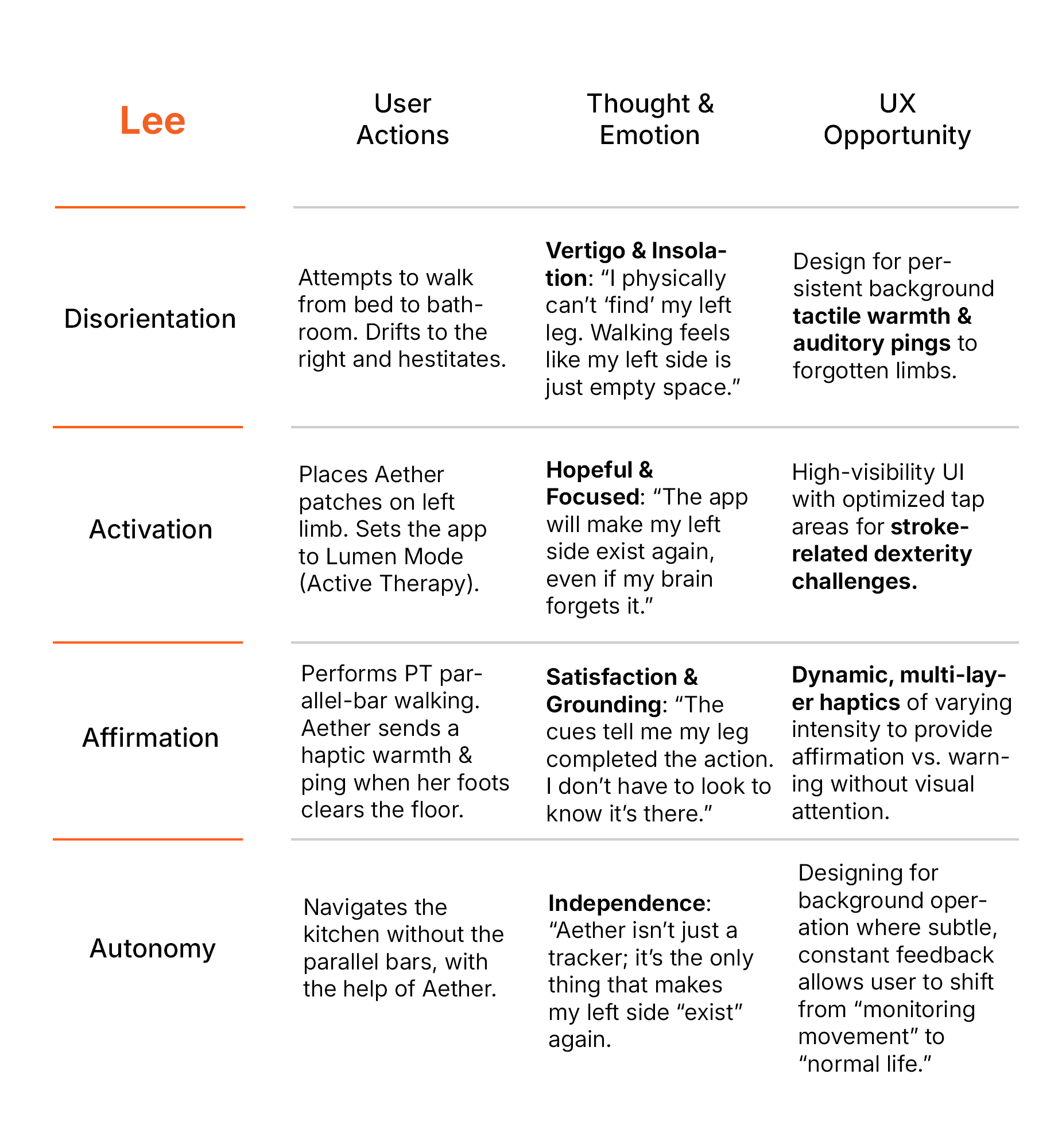
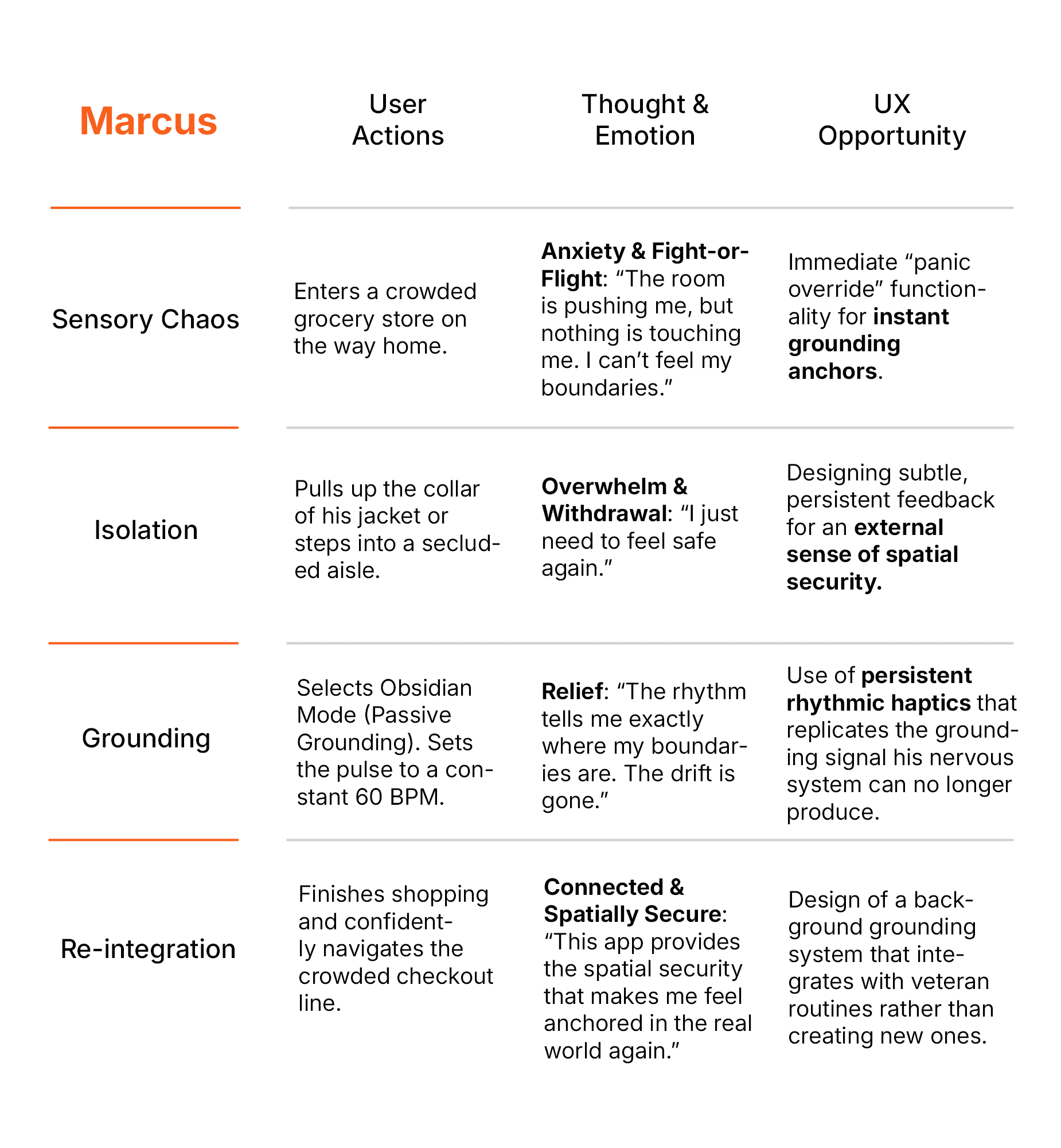
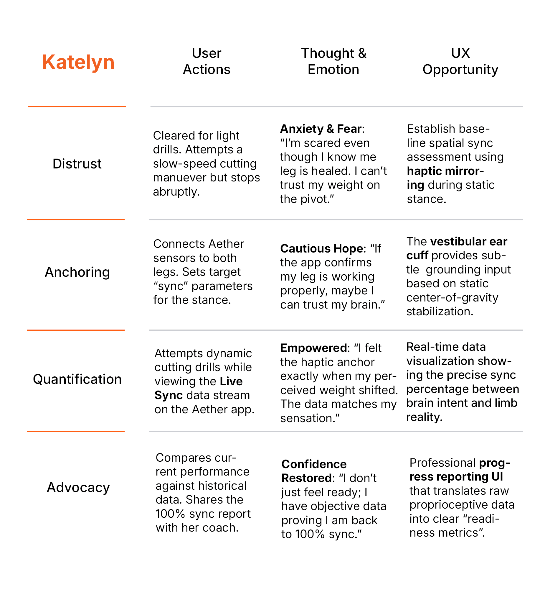
User Personas
Modeled after the diverse recovery needs of combat-injured veterans and stroke survivors, these personas define the unique cognitive and physical boundaries Aether must support.


User Journey Map
A strategic visualization of the user's path through the Aether interface, pinpointing the critical friction points that shaped our functional design interventions during the hackathon.
I developed these journey maps to analyze how users navigate Aether's core functionality. By documenting every touchpoint, I identified where the system needed to shift from simple utility to an intuitive, high-impact tool, ensuring the prototype remained centered on user outcomes.
Goal
To streamline the path to mobility by minimizing cognitive friction and creating an intuitive feedback loop during physical exertion.
The project schematically :
Starting the Design
To bridge the space between thought and form, I began by mapping the complex interplay between Aether's wearable hardware and the digital interface. I developed structural schemes and storyboards to define the sensory feedback loop, followed by low-fidelity prototypes to validate the architectural logic of the Live Sync loop before moving into high-fidelity design.
Appmap
Mapping the ecosystem between haptic feedback and digital tracking to create a seamless, low-friction environment for users navigating neurological recovery.
Developing the application map was a strategic effort to balance real-time haptic communication with a privacy-first data model. I designed a modular hierarchy that centers on user autonomy, ensuring a private-by-default environment that scales to support recovery timelines ranging from several weeks to many years. This structure ensures that the complex data being gathered remains a private tool for recovery rather than a mandatory clinical record.
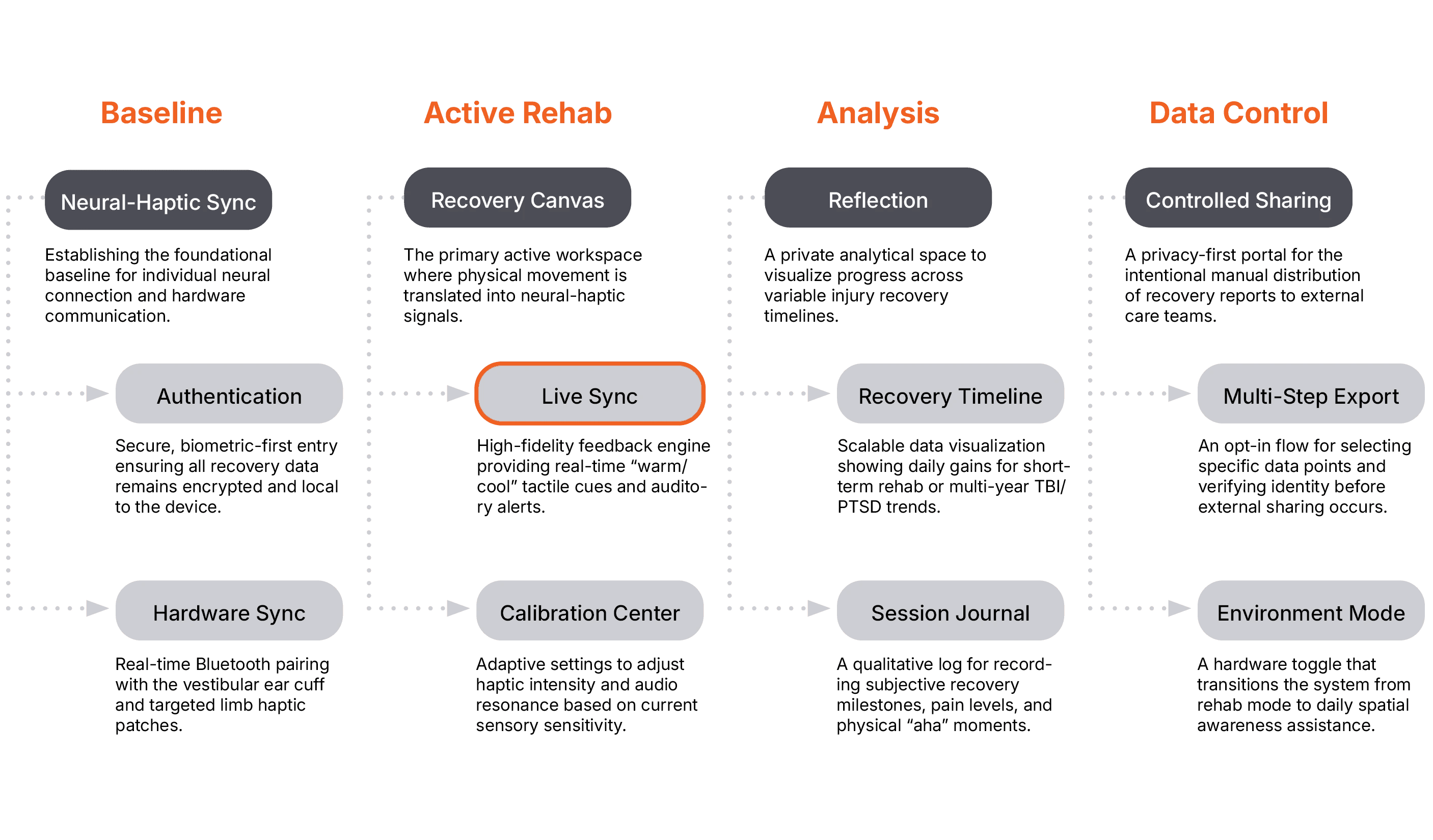
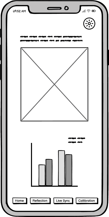
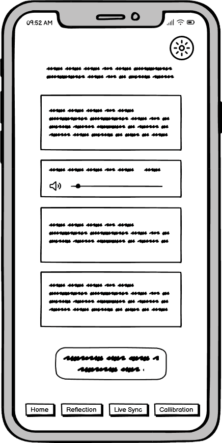
I sketched the foundational interfaces for Aether, including the gait-symmetry dashboard, haptic boundary calibration, and neural recovery tracking. These wireframes allowed us to rapidly explore how to present real-time biometric data and complex neuro-tech settings in a way that feels intuitive and supportive for users navigating trauma-induced sensory loss.
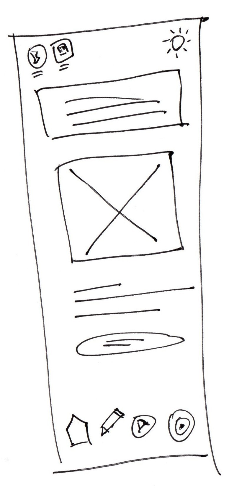
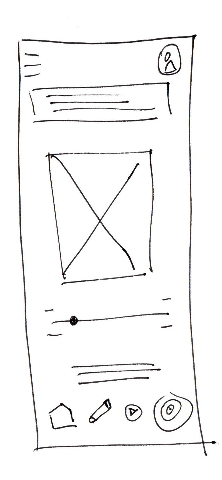
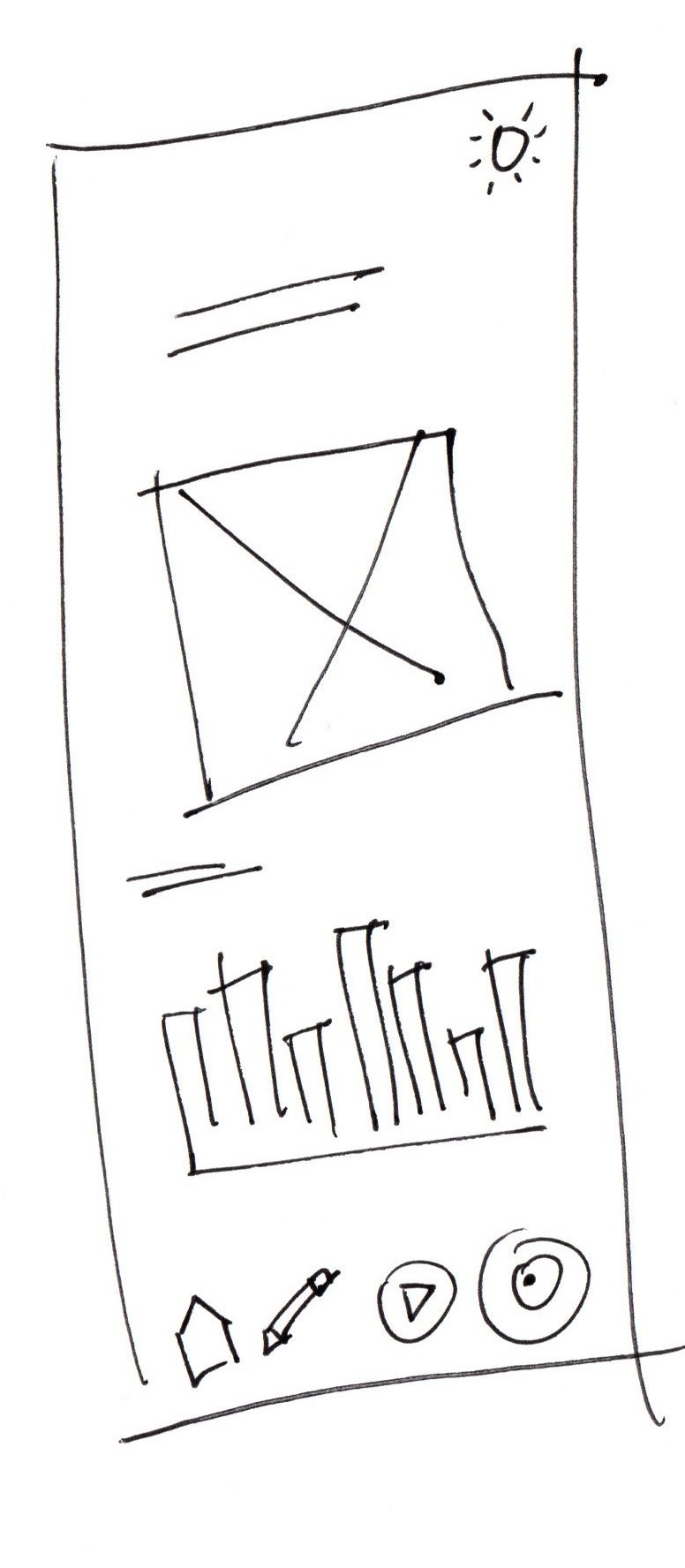
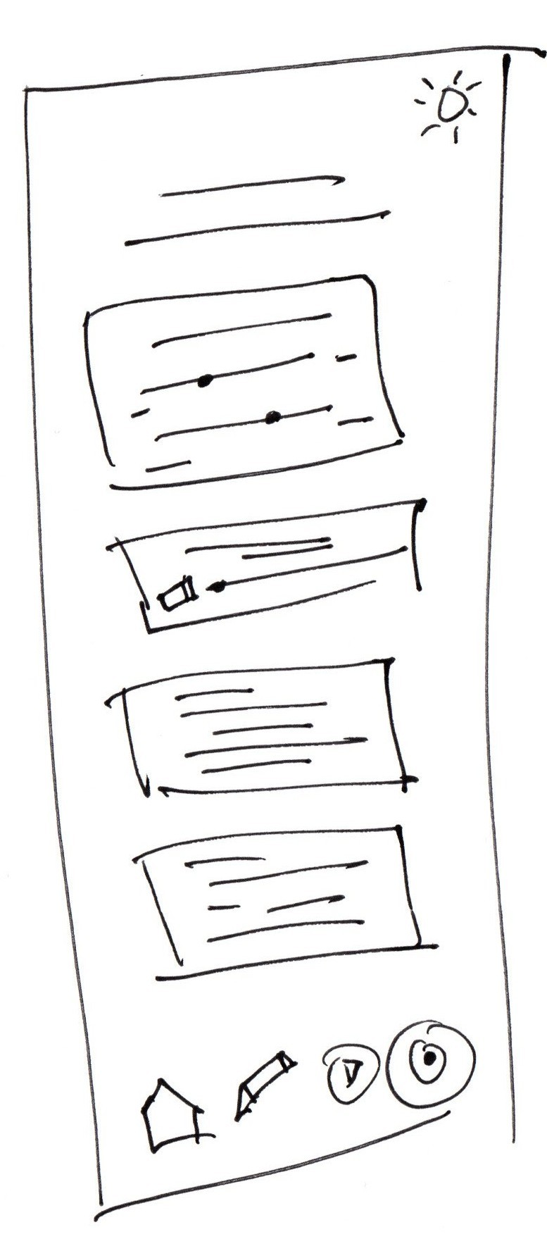
Digital Wireframes
Establishing a low-fidelity blueprint to define the visual hierarchy and placement of core bio-feedback controls before moving into high-fidelity development.
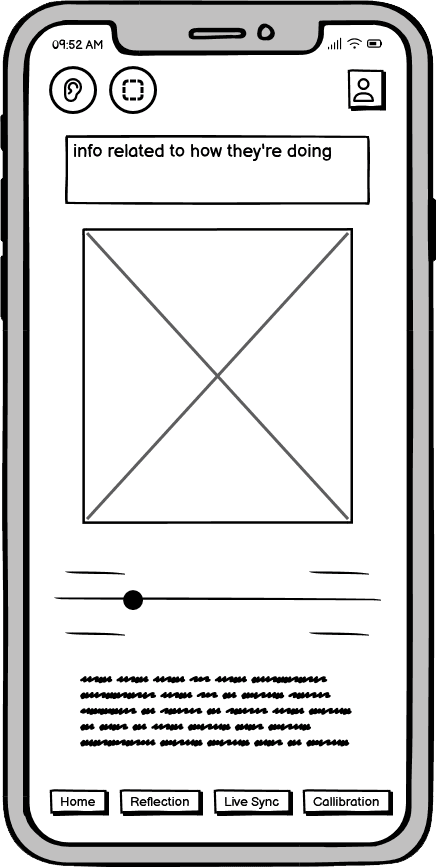
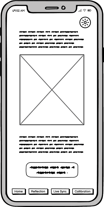
At this stage, I focused on the structural layout of the Live Sync and Reflection views. The goal was to ensure that the most critical recovery data—such as real-time symmetry and long-term progress charts—remained the primary focal point. By simplifying the interface into these digital wireframes, I could validate that the navigation was intuitive enough for users who may be experiencing cognitive or motor fatigue.
Usability Studies
A speculative validation of user needs, utilizing expert interviews and both low- and high-fidelity prototypes to ground a synthetic nervous system concept in the real-world recovery experiences of stroke survivors and veterans.
Within a 3.5-day hackathon sprint, I conducted rapid conceptual testing to validate the core logic of Aether. By presenting the app prototype alongside the hardware concept, I gathered feedback from healthcare professionals, combat-injured veterans, and individuals experience in stroke recovery. This question-based research allowed me to identify the critical psychological and functional requirements for a wearable rehab system before a single piece of hardware would ever be built.
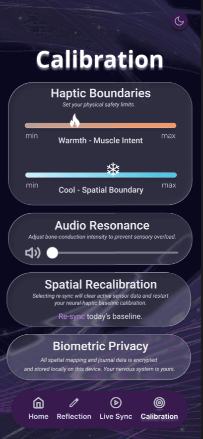
Managing Sensory Overload
The Insight: Healthcare experts and survivors cautioned that sensory noise is a major barrier in early recovery.
The Design Intervention: This feedback led to the creation of the calibration page. It ensures the conceptual haptic and auditory feedback is adjustable, allowing users to dial down the intensity to match their daily energy and comfort levels.
The Requirement of Data Sovereignty
The Insight: Veterans and those in long-term recovery expressed a strong desire for privacy. They were hesitant about any system that automatically reported their daily struggles to an external database or case team.
The Design Intervention: I prioritized a local-first data model. The architecture ensures that all recovery metrics stay on the user's device by default, with any sharing being a deliberate, multi-step choice made by the user.
Visual-to-Tactile Reinforcement
The Insight: Participants noted that the most difficult part of recovery is the silent nature of proprioception loss. They liked the idea of an app showing them what their body is supposed to be feeling.
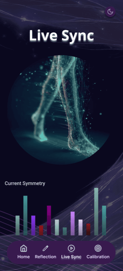
The Design Intervention: This validated the need for the Live Sync visualization. By seeing a visual representation of joint symmetry on the screen, users felt it would help facilitate neuroplasticity by grounding conceptual haptic feedback in tangible visual data.
The clear version :
Refining Design
In the final phase of the 3.5-day sprint, I synthesized the research insights and structural blueprints into a high-fidelity visual system. The design language was intentionally crafted to bridge the gap between complex neuro-rehabilitation and a supportive, intuitive user interface. This involved iterating on the low-fidelity skeletons to ensure that the final mockups remained grounded in the specific accessibility needs of users recovering from neurological trauma.
Mockups
A comprehensive visual framework created to validate the structural logic of the neural-haptic loop, translating complex biological data into a high-contrast, accessible interface.
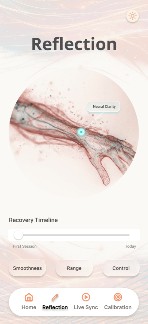
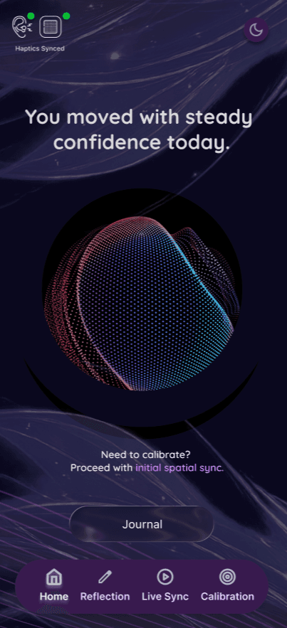
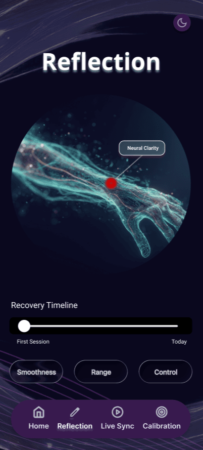
The visual identity of Aether focuses on organic, fluid forms and a sensory-friendly palette designed to minimize cognitive strain. I developed both light and dark modes to accommodate light-sensitivity—a common barrier in TBI and PTSD recovery. By prioritizing high-contrast legibility and large, accessible touch targets, the final UI ensures that calibrating a synthetic nervous system feels like a calm, guided experience rather than a daunting clinical task.


High-fidelity prototype
A high-fidelity motion study of the Aether interface, designed to bridge the gap between intent and movement for stroke survivors, combat-injured veterans, and those recovering from traumatic neural injury.
This walkthrough demonstrates the transitions between Lumen and Obsidian modes, while showcasing real-time gait symmetry and thermal-haptic calibration.


The project schematically :
Outcome
The final phase of the Aether project involved distilling my rapid-prototyping insights into a roadmap for future development, focusing on how synthetic proprioception can bridge the gap between neurological intent and physical form.
Takeways
Aether demonstrates that neuro-rehabilitation interfaces must prioritize sensory grounding and cognitive load management to effectively serve users with complex neural trauma.
Impact:
By integrating thermal haptics and real-time symmetry tracking, Aether establishes a new paradigm for non-invasive recovery tools that empower veterans and stroke survivors to reclaim autonomy over their movements.
What I learned:
I learned that designing for invisible senses like proprioception and kinesthesia requires a departure from traditional UX. Success isn't just about visual clarity—it's about creating a neural conversation between the user and the device.
Next Steps
Moving forward, the focus shifts toward refining the haptic feedback loops and validating the interface through clinical usability testing with our target demographics.
High-Fidelity Haptic Integration
Develop and test physical prototypes of the Thermal Haptic Patches to determine the most effective temperature thresholds for "Muscle Intent" vs. "Spatial Boundaries".
Clinical Co-Design Sessions
Partner with physical therapists and neurology specialists to conduct guided walkthroughs, ensuring the data visualizations align with established rehabilitation protocols.